
Introduction: The Transformative Power of Basket Colors in Home Decor
Baskets are the unsung heroes of interior design—they’re not just functional storage solutions but powerful aesthetic elements that can completely transform your living space. The colors you choose for your baskets play a crucial role in setting the tone and atmosphere of a room, whether you’re aiming for calm serenity or vibrant energy.
When thoughtfully selected, basket colors can tie together disparate elements in your decor, add visual interest to monotone spaces, or serve as the perfect finishing touch that reflects your personal style. The right basket can bridge the gap between function and beauty, turning everyday storage needs into design opportunities.
At Tidy Treasure, we understand that the perfect basket is both beautiful and practical. Our premium wicker and rattan pieces are carefully curated to enhance your interior design while providing the storage solutions you need. Matching baskets in home decor creates a cohesive look that elevates any space from ordinary to extraordinary.
As we explore the world of basket colors, you’ll discover how these versatile pieces can serve as both foundation and accent in your wicker baskets collection, transforming not just how you organize, but how you experience your home.
Natural Basket Materials and Their Inherent Color Profiles
The material of your basket naturally dictates its base color and texture, creating a starting point for your design decisions. Understanding these inherent characteristics helps you make informed choices that enhance your interior design vision.
Seagrass: Features natural variegation with subtle greenish undertones when new. Over time, seagrass ages beautifully into warm beige tones. These baskets add a fresh, organic quality to spaces and work wonderfully in kitchens and sunrooms.
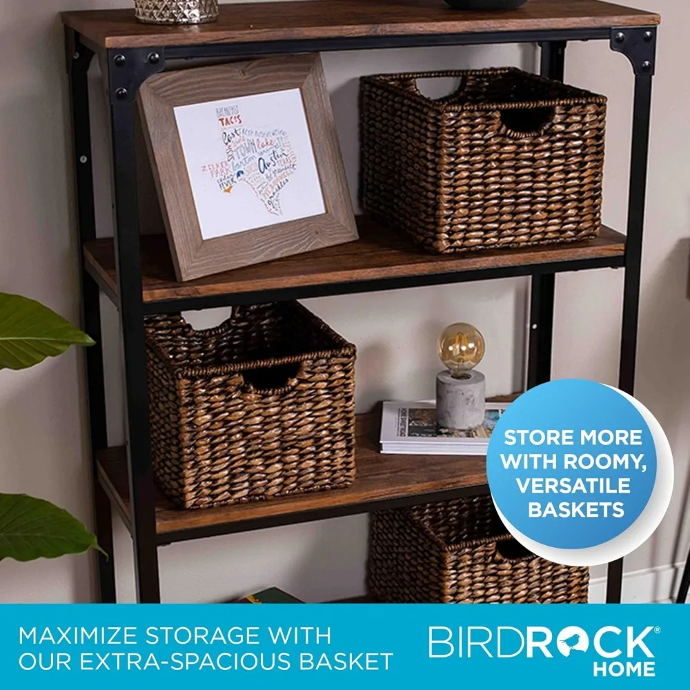
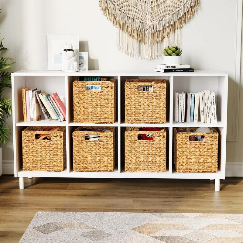
Rattan/Wicker: Offers a spectrum from light honey to deep amber tones with distinctive grain patterns. The warm undertones of rattan basket storage solutions for modern homes make them incredibly versatile across different design styles, from bohemian to contemporary.
Water Hyacinth: Displays rich, warm brown tones with a distinctive braided texture. These baskets have more dimensional weaving patterns, creating visual interest even in monochromatic designs.
Jute & Hemp: Present earthy beige to light brown colors with a distinctive matte finish. Their robust texture makes them ideal for high-traffic areas where durability matters as much as aesthetics.
Bamboo: Ranges from pale yellow to medium brown tones with a smooth, sometimes glossy surface. The linear patterns in bamboo baskets add architectural interest to spaces.
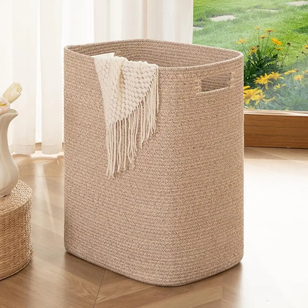
Cotton/Wool Rope: Offers soft off-white natural tones in their undyed state, or can be found in virtually any color when dyed. These baskets provide a softer, more plush texture compared to wood-based materials.
The natural warmth of materials like rattan baskets brings immediate coziness to modern spaces that might otherwise feel cold or sterile. Meanwhile, lighter materials like bleached seagrass can brighten dark corners without seeming out of place.
When selecting basket materials, consider not just their initial appearance but how they’ll age and patina over time. Natural materials typically deepen and warm with age, developing richer character that enhances their appeal in well-designed spaces.
Color Theory Basics for Basket Selection
Understanding basic color theory can transform your basket selection from guesswork into a deliberate design choice that enhances your entire space.
Complementary colors—those opposite each other on the color wheel—create vibrant, eye-catching contrasts. For example, a terra cotta basket against blue walls creates a striking visual interest point. Analogous colors—those next to each other on the color wheel—create harmonious, soothing arrangements, such as beige baskets in a warm brown and cream-colored room.
Warm-toned baskets in honey, amber, and terra cotta hues add coziness and intimacy to spaces. They make large rooms feel more welcoming and can counterbalance cool-colored furniture or walls. Cool-toned baskets, like those in grey-washed or blue-tinted finishes, create a sense of calm and spaciousness, making them perfect for bedrooms or spaces where relaxation is key.
The emotional impact of basket colors shouldn’t be underestimated. Soft neutrals promote tranquility, while rich browns and blacks add sophistication and grounding. Vibrant colored baskets can introduce playfulness and energy to otherwise neutral spaces.
Consider practical examples: navy blue baskets against warm beige walls create a classic, timeless contrast that works in almost any setting. Natural honey-toned baskets paired with soft green walls evoke a organic, garden-inspired atmosphere. When harmonizing your home with stylish matching baskets, remember that consistency in either basket material or color tone creates visual cohesion even across different rooms.
For the color-hesitant, online color wheel tools can help visualize potential combinations before committing to purchases. Taking photos of your space and using digital tools to overlay different basket colors can prevent costly mistakes and ensure your selections enhance your overall design vision.
Core Principles for Selecting the Perfect Basket Colors
1. Harmonizing with Existing Color Schemes
- Identify your space’s dominant color (typically walls or large furniture), secondary colors (upholstery, curtains), and accent colors (cushions, artwork) before selecting baskets.
- For seamless integration, choose basket colors that match or complement your secondary colors rather than competing with dominant elements.
- When working with neutrals, match undertones rather than exact shades—warm beige baskets work better with cream walls than with cool gray ones.
- Consider choosing baskets one shade lighter or darker than your furniture for subtle distinction without disruption.
2. Creating Strategic Contrast
- Dark baskets (deep brown, black, navy) anchor light-colored spaces, creating visual weight and preventing the room from feeling too airy or insubstantial.
- Light-colored baskets (white, cream, light natural) lift dark interiors by breaking up heavy color blocks and reflecting available light.
- For maximum impact, place contrasting basket colors near complementary room colors—rust-colored baskets near blue accents or green baskets in rooms with burgundy elements.
- Use the 60-30-10 design rule: if your dominant and secondary colors account for 90% of the room, let basket colors contribute to the important 10% accent category.
3. Texture-Color Relationship
- Basket texture significantly affects how we perceive color—tight, uniform weaves display more consistent color, while loose, irregular weaves create depth through shadow and light play.
- Light-colored baskets with varied texture add more visual interest than flat light colors.
- Within the same color family, incorporate different textures (smooth, bumpy, loose, tight) to create sophisticated layering effects.
- Remember that high-textured baskets in dark colors can appear even darker due to shadow effects.
4. Lighting Considerations
- Test basket colors in the actual space at different times of day—warm-toned baskets may look rich in morning light but too orange in evening lamplight.
- North-facing rooms with cool light benefit from warm basket tones to balance the bluish natural light.
- South-facing rooms with ample warm light can handle cooler basket tones without feeling cold.
- Consider how artificial lighting affects perception—incandescent bulbs warm up basket colors, while LED lights might make them appear cooler or more stark.
The right wicker baskets with lids can transform ordinary storage into design features that enhance your space while keeping items neatly tucked away. When selecting colors, remember that the perfect basket should feel like it belongs in your space—neither disappearing completely nor standing out awkwardly.
Basket Color Palettes for Popular Interior Design Styles
Scandinavian
- Core Palette: Light neutrals (white, cream, pale gray), bleached wood tones
- Accent Colors: Occasional black or charcoal for contrast, muted blues
- Best Materials: Bleached seagrass, white-washed rattan, light unfinished woods
- Application: In living rooms, light neutral baskets with simple weaves enhance the clean aesthetic while wicker baskets in Scandinavian design add essential warmth to prevent spaces from feeling clinical. For bedrooms, soft white rope baskets maintain the airy feeling while providing gentle texture.
Bohemian
- Core Palette: Rich earthy tones (terra cotta, mustard, olive), natural browns
- Accent Colors: Jewel tones like emerald, sapphire, and ruby
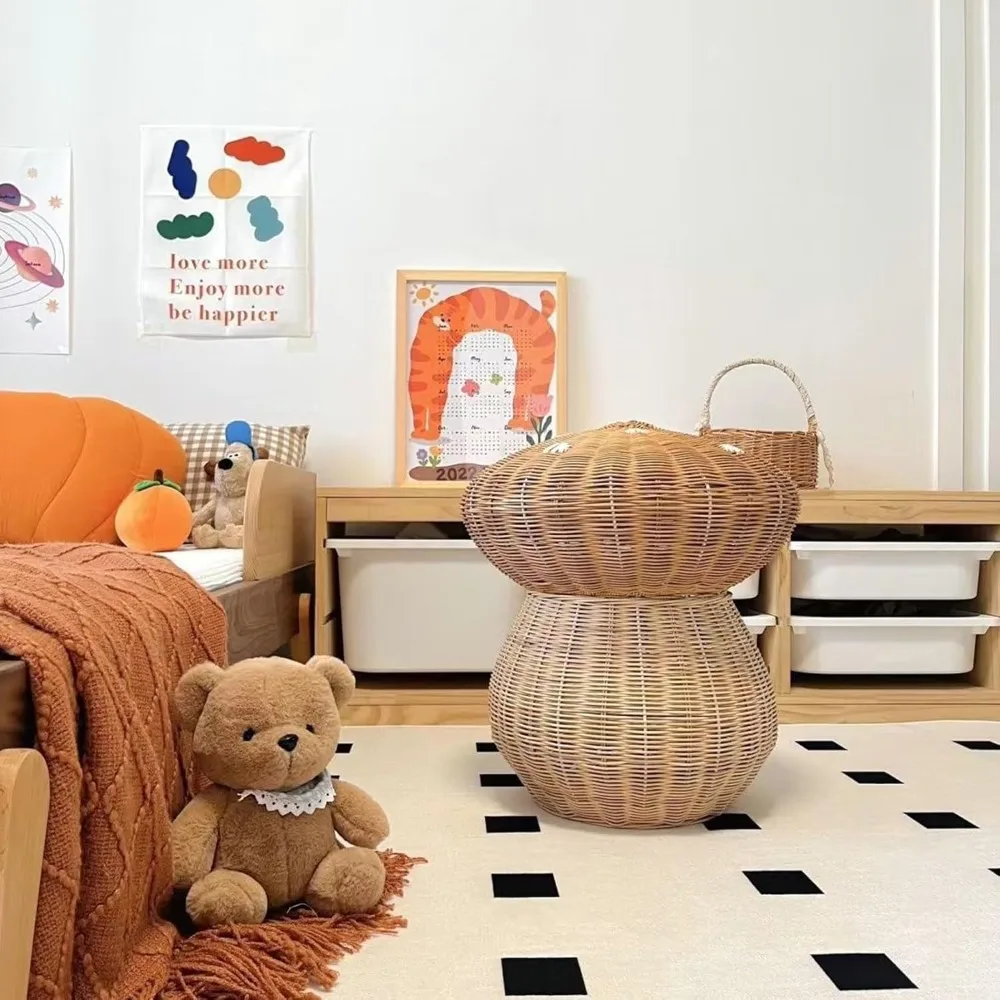
- Best Materials: Varied natural materials—water hyacinth, dark rattan, colorfully dyed fibers
- Application: Mix and match basket colors and materials in living spaces for eclectic energy. In bedrooms, layer baskets of complementary colors (amber, rust, and burgundy) for a collected-over-time feeling. Bathrooms benefit from richly colored water-resistant baskets that add warmth to white fixtures.
Modern Farmhouse
- Core Palette: Warm neutrals, creamy whites, weathered grays
- Accent Colors: Black metal accents, navy blue touches
- Best Materials: Honey-toned wicker, gray-washed rattan, whitewashed reed
- Application: Kitchen spaces shine with honey-toned gathering baskets. Living areas benefit from larger whitewashed baskets for blanket storage. Bathrooms and laundry rooms look cohesive with gray-washed utility baskets that reference both the warmth and practicality of farmhouse design.
Coastal/Hamptons
- Core Palette: Whites, blues in all shades, sandy beiges
- Accent Colors: Seafoam green, driftwood gray
- Best Materials: Whitewashed rattan, bleached seagrass, rope baskets
- Application: Entryways benefit from white or bleached baskets for a fresh welcome. Living spaces feel appropriately relaxed with natural seagrass baskets in sandy tones. Bedrooms maintain the breezy coastal feeling with pale blue or white rope baskets for clothing or accessories.
Minimalist
- Core Palette: Monochromatic schemes, usually in whites, blacks, and grays
- Accent Colors: One consistent accent color or no accent at all
- Best Materials: Clean-lined rattan, uniform weave patterns, streamlined shapes
- Application: Throughout minimalist homes, basket colors should be consistent and understated. The incorporation of wicker in minimalist design focuses more on subtle texture variations than color contrasts. Black or white baskets with hidden internal storage work well in all rooms, maintaining clean visual lines.
Industrial
- Core Palette: Darker tones, charcoals, deep browns
- Accent Colors: Rust, copper, blackened metal tones
- Best Materials: Dark-stained rattan, black-dyed fibers, baskets with metal elements
- Application: Living spaces benefit from darker baskets that complement exposed brick or concrete. Home offices gain organization and style from black or charcoal baskets with clean lines. Even kitchens can incorporate dark basket tones when paired with metal elements for authentic industrial appeal.
Room-by-Room Basket Color Guide
Living Room
- Choose basket colors that either complement or thoughtfully contrast with your main furniture pieces—medium-toned baskets often work well with both light and dark sofas.
- For magazine or remote storage, select basket colors that coordinate with coffee tables rather than competing with them.
- If you have colorful throw pillows, consider baskets in a neutral from the same color family to create cohesion without overwhelming.
- Statement baskets in contrasting colors work best when they have room to “breathe” visually—place them with space around them rather than crowded among other items.
Bedroom
- Opt for basket colors in the same family as your bedding but a shade or two lighter or darker for sophisticated coordination.
- Bedside table baskets should complement both the table and lamp bases for a cohesive nighttime vignette.
- Under-bed storage baskets should be in calming neutrals that don’t create visual disruption when partially visible.
- Consider the emotional effect of colors—cooler tones promote restfulness while warmer tones create coziness.
Bathroom
- White or light-colored baskets brighten smaller bathrooms and coordinate easily with most fixture colors.
- Create intentional contrast against tile—darker baskets against light tile or lighter baskets against dark tile.
- Consider matching laundry baskets with your home decor in bathrooms for cohesive design that doesn’t sacrifice functionality.
- Water-resistant materials like sealed rattan or plastic-lined options in colors that hide potential water spots work best for long-term appeal.
Kitchen/Dining
- Warm basket tones (honey, amber, brown) enhance the welcoming feel of kitchen and dining spaces.
- For open shelving, choose basket colors that stand out slightly from dishware for visual definition.
- Food storage baskets benefit from lighter colors that make contents easier to identify.
- Coordinate bread or fruit basket colors with cutting boards or wooden utensils for material continuity.
Woven storage baskets in carefully selected colors can transform not just how you organize your spaces, but how those spaces feel. The right basket color creates a bridge between functionality and design, making necessary storage into a feature worth showcasing.
Advanced Color Strategies for Basket Arrangements
Creating cohesive basket arrangements throughout your home requires thoughtful color planning. Rather than matching baskets exactly, consider working within color families—various shades of warm neutrals or cool grays—to create sophisticated depth while maintaining harmony. This approach allows for visual interest without chaos.
Gradation techniques create especially elegant displays. Arrange multiple baskets from lightest to darkest within the same color family, creating a satisfying visual progression that draws the eye. This works particularly well on open shelving or along stairways.
For organization purposes, color-coding systems using baskets can be both functional and beautiful. Assign specific colors to different categories—perhaps blue baskets for winter accessories, natural tones for summer items, and warmer hues for fall and holiday storage.
Consider seasonal rotation of basket colors to refresh your space without major renovations. Lighter, brighter baskets in spring and summer can transition to deeper, richer tones in fall and winter, reflecting the changing natural light and mood of each season.
For specific color needs that natural materials don’t provide, painted or dyed baskets offer unlimited possibilities. These work exceptionally well as accent pieces when you want to introduce a specific color that ties to artwork or a signature decorative element.
Black wicker baskets make particularly strong accent pieces, creating dramatic contrast against lighter walls and furniture while adding sophisticated edge to neutral spaces.
Troubleshooting Common Basket Color Challenges
Q: My room is very neutral. What basket color adds interest without overwhelming?
A: Introduce baskets one or two shades darker than your dominant neutral for subtle depth. For example, in a beige room, consider walnut-toned baskets rather than stark black or bright colors. This creates distinction without disruption.
Q: How do I choose basket colors that work with patterned rugs or upholstery?
A: Pull the most neutral color from your pattern for your baskets. If your rug features blues, reds, and beige, opt for beige baskets that won’t compete with the pattern but still feel connected to the overall scheme.
Q: Should my baskets match my wood furniture tone?
A: Rather than exact matching, which can look flat, choose baskets slightly lighter or darker than your furniture. This creates a coordinated but layered look that has more design sophistication than perfect matching.
Q: What are the best basket colors for rooms with limited natural light?
A: Lighter basket colors—bleached woods, white-washed finishes, or pale natural fibers—help reflect what little light is available. Avoid very dark baskets which can create “black holes” in dimly lit spaces.
For spaces with unusual color challenges, round wicker baskets in neutral tones offer versatile solutions that can work with virtually any color scheme while their circular shape adds a softening effect to angular rooms.

Black Wicker Baskets, Rattan Storage Baskets, Tall Wicker Baskets, Wicker Shelf Baskets, Woven Storage Baskets
5-Tier Distressed Black Wood Frame Storage Tower with Removable Wicker Baskets for Home Organization$715.80 Select options This product has multiple variants. The options may be chosen on the product page
Wicker Laundry Baskets, Woven Laundry Baskets, Woven Storage Baskets
$392.02 Select options This product has multiple variants. The options may be chosen on the product page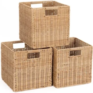
Rattan Shelf Baskets, Rattan Storage Baskets, Small Wicker Baskets, Square Wicker Baskets
Square Plastic Wicker Storage Baskets Set of 3 with Collapsible Design for Cube Storage Organization$185.47 Select options This product has multiple variants. The options may be chosen on the product page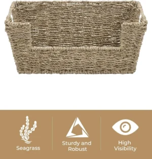

Wicker Baskets with Handles, Wicker Storage Baskets, Woven Storage Baskets
$137.92 Select options This product has multiple variants. The options may be chosen on the product page
Large Wicker Laundry Baskets, Tall Wicker Baskets, Woven Laundry Hampers, Woven Storage Baskets
$130.54 Select options This product has multiple variants. The options may be chosen on the product page
Wicker Blanket Baskets, Woven Laundry Baskets
$89.60 Select options This product has multiple variants. The options may be chosen on the product page
Maintaining and Refreshing Basket Colors Over Time
Natural basket materials inevitably change color as they age, often developing a rich patina that adds character. Seagrass typically darkens to a warm golden tone, while rattan may deepen from honey to amber. These changes usually enhance rather than detract from their beauty.
To preserve your desired basket colors, consider these simple maintenance tips. Keep natural fiber baskets out of direct sunlight, which can cause uneven fading or yellowing. For baskets that receive heavy use, rotate their position occasionally to ensure even color development.
When baskets begin to look tired, gentle cleaning can often restore their vibrancy. A soft brush vacuum attachment removes dust that dulls color, while lightly dampened cloths can refresh most natural fibers without causing damage.
For more significant color issues like mold spots that affect appearance, understanding the ultimate guide to removing mold from baskets can help restore your pieces to their former beauty rather than replacing them.
Consider a seasonal rotation system for baskets that receive heavy use or exposure. This prevents any single basket from showing excessive wear while providing refreshed looks throughout your home as the seasons change.
Elevating Your Interior Design with Premium Basket Collections
Investing in quality baskets ensures better color consistency and longevity throughout your home. Premium baskets display more uniform dyeing or natural coloration, creating a more sophisticated look than lower-quality alternatives that may have blotchy or inconsistent finishes.
When examining baskets for purchase, pay attention to weaving patterns and color consistency. High-quality pieces show attention to detail with even weaving and consistent coloration throughout. These details make a significant difference in how the baskets present in your carefully designed spaces.
Quality baskets like those from Tidy Treasure maintain their aesthetic appeal significantly longer than cheaper alternatives. Their color stability and structural integrity ensure that your design choices continue to enhance your home for years rather than months.
The value of versatile basket colors cannot be overstated—neutral, high-quality baskets can transition between rooms and design styles as your needs change. This adaptability makes them a wise investment for elevating home decorating with matching wicker baskets throughout your living spaces.
Creating Your Personal Basket Color Strategy
Developing a cohesive basket color plan for your entire home begins with documentation. Take photos of each room and note the dominant colors, existing wood tones, and key decorative elements. This visual inventory becomes your reference point for selecting basket colors that create flow between spaces.
Create a simple basket color palette for your home with 2-3 main basket colors that work throughout different rooms. Perhaps natural honey tones for common areas, whitewashed finishes for bedrooms, and a deeper accent color for occasional contrast pieces.
Before committing to multiple baskets, test your chosen colors in different lighting conditions. Place sample baskets in intended locations during morning, afternoon, and evening hours to observe how lighting affects their appearance. What looks perfect at noon might seem too dark or light by lamplight.
Build your collection gradually rather than purchasing everything at once. Begin with key functional pieces in versatile colors, then add more specific or statement baskets as you refine your style. This approach ensures thoughtful integration with your matching storage baskets for interior design.
While following design principles provides a helpful framework, trust your personal preferences. Your emotional response to certain colors matters—baskets you genuinely love will bring more joy than those that merely follow design rules.
Conclusion: Weaving Color into Your Home Story
Thoughtful basket color selection transforms ordinary storage into extraordinary design elements that enhance your entire home. By understanding color relationships, material characteristics, and placement strategies, you’ve gained the tools to make confident choices that reflect your personal style.
The beauty of baskets lies in their dual nature—they solve practical storage challenges while simultaneously elevating your interior design. When basket colors are chosen with intention, these humble objects become powerful design tools that can anchor a space, create subtle connections between rooms, or add unexpected moments of delight.
Don’t be afraid to experiment with different basket colors as your home evolves. Small changes in basket placement or color can refresh a room without the commitment of painting walls or replacing furniture. Let your wicker storage baskets tell a color story that makes your house feel truly like home—organized, beautiful, and uniquely yours.